Ready to break free from the rectangular box and sculpt truly unique layouts on the web? Then you're in the right place. Harnessing the power of clip-path in CSS lets you define custom shapes for your elements, transforming ordinary divs into circles, stars, arrows, or even complex abstract forms. But manually crafting the intricate coordinate values for these shapes can feel like trying to draw with a ruler and protractor in the dark. That's where Using a Clip-Path Generator Effectively becomes your superpower, simplifying the process into a visual, intuitive art form.
Think of it as having a digital chisel and clay, rather than just a simple saw and timber. A good clip-path generator offers an interactive canvas where you can visually design your shapes and instantly get the clean, production-ready CSS code. This guide will walk you through unlocking that power, making advanced shape creation accessible and enjoyable.
At a Glance: Your Takeaways for Effective Clip-Path Generation
- Custom Shapes, No Images:
clip-pathlets you create non-rectangular designs directly in CSS, reducing reliance on image assets for simple shapes. - Visual Editors are Key: Generators like Codeshack.io and Unused-CSS.com simplify complex
polygon()syntax into an intuitive drag-and-drop experience. - Responsiveness Built-In: Generated
clip-pathvalues typically use percentages, ensuring your shapes scale gracefully across different screen sizes. - Polygons Offer Ultimate Control: While basic shapes are quick, the polygon tool provides granular control by letting you add and manipulate individual points.
- Leverage Advanced Features: Grids, snapping points, and modifier keys in advanced generators can drastically improve precision and speed for intricate designs.
- Don't Forget Fallbacks: While widely supported, always consider graceful degradation for older browsers by providing a simpler fallback style.
Why Break the Box? The Power of clip-path in Modern Web Design
For decades, the web was a world of rectangles. Every image, every button, every content block was bound by its four straight edges. While border-radius brought us gentle curves, clip-path shatters those boundaries entirely, ushering in an era of truly dynamic and distinctive web layouts.
The clip-path CSS property functions much like a pair of digital scissors, allowing you to hide specific parts of an element. Instead of simply drawing a shape around content, clip-path literally clips a piece out of an existing element. The hidden parts become completely transparent and unclickable, allowing the visible portion to take on the form of your chosen shape—be it a perfect circle, a sleek ellipse, or an intricate polygon.
This isn't just about aesthetics; it's about pushing the boundaries of user experience. Imagine:
- Unique Hero Sections: A striking banner image clipped into an arrow pointing down to content.
- Interactive Grids: Image galleries where thumbnails are hexagonal or diamond-shaped.
- Engaging UI Elements: Buttons or navigation items that break the mold with custom, eye-catching forms.
Crucially,clip-pathachieves these effects without relying on image editing software. This means: - Faster Load Times: No extra image files to fetch.
- Seamless Responsiveness: Since
clip-pathvalues are typically defined using percentages (e.g.,polygon(0% 0%, 100% 0%, 50% 100%)), your shapes automatically scale and maintain their proportions relative to the element's dimensions, looking great on any device. - Easier Maintenance: Adjusting a shape is a matter of tweaking CSS values, not re-exporting an image.
Modern web browsers like Chrome, Firefox, Safari, and Edge fully supportclip-path, making it a reliable tool for contemporary web development. The only significant holdout is Internet Explorer, which is no longer widely used or supported, simplifying compatibility concerns for most projects.
Choosing Your Clip-Path Ally: An Overview of Generators
While understanding the clip-path property is valuable, hand-coding complex shapes, especially polygons, is a tedious and error-prone exercise. You'd spend more time calculating percentage-based coordinates than designing. This is precisely why clip-path generators are indispensable. They act as visual editors, allowing you to manipulate shapes with your mouse and instantly generating the correct CSS code.
Think of them as your design workbench. Each generator offers a slightly different set of tools and a distinct workflow. Let's look at two prominent examples that embody different strengths, helping you decide which fits your task best.
Codeshack.io CSS Clip-Path Generator: The Intuitive Starting Point
For many, Codeshack.io is an excellent entry point into the world of clip-path. It's designed for instant gratification and clear visual feedback, allowing you to create shapes and see results without getting bogged down in intricate controls. Its focus is on making the creation process as straightforward as possible.
Key Strengths:
- Simplicity: Very clean interface, ideal for beginners.
- Instant Visual Feedback: Changes are reflected in real-time.
- Easy Image Preview: You can paste a URL to your own image to see the clip-path applied, offering immediate context.
- Local Processing: All calculations happen in your browser, ensuring privacy and data safety.
Unused-CSS.com CSS Clip Path Generator: The Precision Powerhouse
If you need surgical precision, advanced editing capabilities, and a collaborative workflow, Unused-CSS.com steps up. It takes the visual editing concept further by integrating tools that cater to more complex geometric requirements and iterative design processes.
Key Strengths:
- Grid System with Snapping: Essential for creating perfectly aligned points, right angles, and symmetrical shapes.
- Advanced Interaction: Intuitive ways to add, select, and manipulate multiple points.
- Code Parsing and Editing: Allows you to paste existing
clip-pathcode to refine or modify it. - Collaboration Features: Ability to share creations via permanent links, making design iterations with teammates much smoother.
The choice often comes down to the complexity of your shape and your workflow. For quick, basic shapes, Codeshack.io shines. For intricate designs requiring mathematical precision or collaborative refining, Unused-CSS.com offers a robust toolkit. Many designers find themselves using both, leveraging Codeshack for initial ideas and Unused-CSS for final tweaks.
Mastering the Basics: Your First Shapes with a Generator (Codeshack.io Focus)
Let's dive into the practical steps of creating shapes using a generator, with a particular focus on the approachable workflow of Codeshack.io. This will give you a solid foundation before we explore more advanced techniques.
The core idea is simple: you pick a basic shape, manipulate it visually, and then grab the generated CSS.
Step 1: Selecting Your Canvas and Basic Shape
When you first land on a generator, you'll typically see a default shape on a preview area. Your first task is to choose the base shape you want to work with. Codeshack.io offers excellent starting points:
- Inset: Imagine a rectangle within a rectangle.
inset()allows you to clip an element by defining how far in from each edge (top, right, bottom, left) the clipping path should start. You can also addborder-radiusto the inset. - Circle: Clips an element into a perfect circle. You define its radius and its position (the center point).
- Ellipse: Similar to a circle, but allows for different horizontal and vertical radii, creating oval shapes. You define two radii and the center point.
For these basic shapes, the generator usually provides sliders or input fields. For instance, with a "Circle," you might drag a "Radius" slider to expand or shrink the circle, and then drag the circle itself to position its center. The beauty here is the instant feedback: you see the shape change as you adjust.
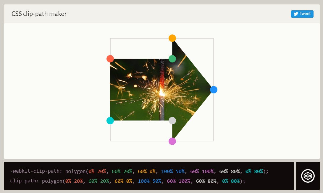
Step 2: Diving into Polygons – Precision with Points
This is where the real creative power of clip-path lies. The polygon() function allows you to define a shape using any number of straight-line segments. It's like connecting the dots.
When you select "Polygon" in a generator, the preview area transforms into a canvas for drawing.
- Adding Points: Simply click anywhere on the preview image to add a point. Each click adds a new vertex to your polygon. As you add points, the generator automatically draws lines between them. To close the shape, the last point you add will connect back to the first.
- Moving Points: Once a point is placed, you can click and drag it to adjust its position. This allows you to fine-tune the angles and lengths of your polygon's edges.
- Loading Presets: Codeshack.io also offers a handy collection of preset polygon shapes, such as triangles, stars, arrows, and speech bubbles. This is fantastic for quick starts or for learning how complex shapes are constructed. Clicking a preset instantly loads its points onto the canvas, which you can then modify.
Under the Hood (The Invisible SVG Layer):
Generators like Codeshack.io make this process seamless by using an invisible SVG (Scalable Vector Graphics) layer over the preview image. When you click to add a point or drag an existing one, this layer records the precise coordinates of your actions. Critically, these coordinates are percentage-based. So, if you drag a point halfway across the width of your element, the generator records it as50%. This is the mechanism that ensures your generated shapes are inherently responsive.
Step 3: Previewing and Perfecting
Seeing your clip-path on a generic background is useful, but seeing it on your actual content is invaluable. Codeshack.io allows you to paste a URL to your own image into a designated field. Hit "Load" or "Preview," and your custom shape will instantly be applied to your image, giving you a real-world context for your design. This step is crucial for visual consistency and ensuring the shape works with your content's aesthetics.
Step 4: Copying and Implementing Your Code
Once you're satisfied with your shape, the generator displays the corresponding CSS code. It will look something like this:
css
clip-path: polygon(50% 0%, 0% 100%, 100% 100%); /* For a simple triangle /
-webkit-clip-path: polygon(50% 0%, 0% 100%, 100% 100%); / For older Webkit browsers */
You'll usually see both the standard clip-path property and a -webkit-clip-path prefixed version. While modern browsers have largely dropped the need for prefixes, it's good practice to include the -webkit- version for slightly older Safari or Chrome versions that might still require it.
Simply copy this code and paste it into the CSS rules for the HTML element you wish to shape. Remember to apply it to a block-level element like a div, img, or section.
Ready to give it a try? You can easily access the clip-path generator and start experimenting with these basic shapes right away. It's the best way to get a feel for how intuitive the process truly is.
Advanced Techniques: Unleashing Precision with Grid and Controls (Unused-CSS.com Focus)
While Codeshack.io excels at making clip-path accessible, some designs demand a level of precision that goes beyond simple point dragging. This is where more feature-rich generators, like Unused-CSS.com, truly shine. They offer a suite of tools for meticulous design, complex shape refinement, and efficient workflow.
The Power of the Grid: Geometric Accuracy
One of Unused-CSS.com's standout features is its automatic grid system, complete with snapping points. This isn't just for decoration; it's a powerful aid for geometric precision:
- Snap To Grid: When enabled, your points will "snap" to the nearest grid line or intersection. This is invaluable for:
- Right Angles: Effortlessly creating perfect 90-degree corners for arrowheads, speech bubbles, or intricate geometric patterns.
- Equal Lengths: Ensuring symmetrical designs by snapping points to equidistant grid lines.
- Perfect Alignment: Vertically or horizontally aligning points across your shape for a polished, professional look.
- Visualizing Intent: The grid helps you visualize the underlying structure of your shape, making it easier to plan and execute complex designs. Imagine trying to make a perfectly equilateral triangle or a regular star without any alignment guides—it would be a guessing game. The grid eliminates that.
Intelligent Editing: Refining Complex Shapes
Beyond simple point manipulation, Unused-CSS.com offers several smart ways to interact with your shapes:
- Pasting Existing Code: Have a
clip-pathvalue from another project, or perhaps one generated by a different tool, that you want to tweak? Simply paste theclip-path()code into the output box. The generator will parse it, render the shape visually, and let you edit the points interactively. This is a game-changer for iterative design and refining existing assets. - Dynamic Point Addition: Need to insert a new point between two existing ones? Just drag from the middle of a line segment. The generator intelligently adds a new vertex, allowing you to easily introduce more detail or smooth out a curve (by adding more points along what would be a curve, making it appear curved).
- Dragging the Whole Shape: Sometimes you've designed a perfect shape but realize it needs to shift position within its element. Instead of moving each point individually, you can drag the entire shape on the canvas, preserving its integrity.
Modifier Keys for Granular Control
To further enhance precision and control, Unused-CSS.com leverages common modifier keys:
- Hold
Shiftto Temporarily Disable Grid: When "Snap To Grid" is active, but you need to place a point with absolute freedom for a moment, holding downShiftwhile dragging a point will temporarily disable the snapping feature. This is perfect for subtle adjustments that don't fit the grid. - Hold
Shiftwhile Clicking to Select Two Corners: Want to manipulate two specific points simultaneously?Shift+click on each point to select them both. This allows you to drag or nudge them together, maintaining relative distances. - Drag a Box Around Multiple Corners to Select Them: For more complex sections of your polygon, you can click and drag to draw a selection box around multiple points. All selected points can then be moved, scaled, or otherwise transformed as a group.
- Click on an Edge to Select Two Corners: A quick way to select the two points that define a specific line segment. This is useful for adjusting the angle or length of a particular edge.
Essential Actions: Undo, Redo, Save, Share
Any advanced design tool needs robust workflow features, and Unused-CSS.com delivers:
- Undo (
Ctrl+Zor⌘+Z) & Redo (Ctrl+Yor⌘+⇧+Z): Make a mistake? No problem. These universal shortcuts allow you to revert or reapply changes, empowering fearless experimentation. - New (
Ctrl+Nor⌘+N): Quickly clear the canvas and start a fresh shape. - Save (
Ctrl+Sor⌘+S): While the tool runs locally in your browser, this feature often saves your current shape locally in your browser's storage, allowing you to close and reopen the tab without losing your work. - Copy The Snippet (
Ctrl+Cor⌘+C): Generates and copies theclip-pathCSS code to your clipboard, ready for pasting into your stylesheet. - Sharing Creations: One of the most powerful features for collaborative teams or showcasing your work. Unused-CSS.com often provides a permanent link to your created shape. Sharing this link allows others to view your design and even load it into the generator for further editing, streamlining feedback and iteration cycles.
By mastering these advanced controls, you transform a basicclip-pathgenerator into a sophisticated design instrument, capable of producing highly precise and visually compelling shapes for any web project.
Beyond the Generator: Best Practices for Effective clip-path Use
While generators make the creation of clip-path values effortless, using them effectively in a real-world web project requires a thoughtful approach to ensure responsiveness, accessibility, and performance. The generated code is just the starting point; how you integrate it matters.
Responsiveness is Key (And Already Handled!)
We've touched on this, but it bears repeating: clip-path values generated using percentages (polygon(0% 0%, 100% 0%, 50% 100%)) are inherently responsive. This means the shape will scale proportionally with the element it's applied to.
Best Practice:
- Test on Various Viewports: Always test your clipped elements across different screen sizes and device orientations. Use your browser's developer tools to simulate various viewports. This helps you confirm that your design maintains its integrity and visual impact.
- Avoid Fixed Pixel Values: While
clip-pathcan accept pixel values, doing so largely negates the responsiveness benefits. Stick to percentages orem/remunits where appropriate for the most adaptable designs.
Accessibility Considerations: Don't Hide from Everyone
clip-path visually hides parts of an element. For users relying on screen readers or other assistive technologies, this visual effect is irrelevant. The entire content of the element still exists in the DOM.
Best Practice:
- Don't Clip Essential Information: Never use
clip-pathto hide text or crucial information that users must see to understand your content or navigate your site. If the shape is purely decorative, that's fine. If it's clipping off half a button's label, that's a problem. - Maintain Contrast: Ensure the visible parts of your clipped element (especially if it contains text) still meet WCAG contrast guidelines against the background.
- Use
aria-hiddenfor Purely Decorative Elements: If you're clipping an image or div that serves no functional purpose and is purely for visual flair, consider addingaria-hidden="true"to prevent screen readers from announcing its presence, which could be confusing. - Focus Management: Be aware that the entire element's bounding box is still part of the DOM for focus purposes. If you clip an interactive element like a button, users might still be able to tab to the visually hidden areas. Ensure the visible part of the button is where interaction is expected.
Performance Impact: Keep It Smooth
Generally, clip-path has a minimal performance impact. Modern browsers are highly optimized for rendering CSS properties.
Best Practice:
- Avoid Overly Complex Polygons: While
polygon()allows for hundreds of points, extremely intricate shapes with excessive vertices can slightly increase rendering time, especially during animations or repaints. Aim for the simplest shape that achieves your design goal. A 10-point star is usually fine; a 100-point fractal might be pushing it. - Test Animations: If you're animating
clip-path(more on that below), test thoroughly to ensure smooth transitions without jank, especially on lower-powered devices.
Browser Fallbacks (Graceful Degradation): A Plan B for Older Browsers
As mentioned, clip-path is not supported by very old browsers like Internet Explorer. While this is less of a concern now, it's always good practice to consider what users on unsupported browsers will see.
Best Practice:
- Provide a Rectangular Fallback: For browsers that don't support
clip-path, the element will simply render as a standard rectangle. Design your page so that this default rectangular rendering is still acceptable and doesn't break the layout. - Use Feature Queries (
@supports): For more control, you can use CSS feature queries to apply different styles based on browser support.
css
.my-clipped-element {
/* Fallback style for browsers that don't support clip-path /
background-color: lightblue; / Example fallback /
border-radius: 15px; / Another example /
}
@supports (clip-path: polygon(0 0)) {
.my-clipped-element {
/ Styles applied only if clip-path is supported /
clip-path: polygon(50% 0%, 0% 100%, 100% 100%);
-webkit-clip-path: polygon(50% 0%, 0% 100%, 100% 100%);
background-color: transparent; / Or whatever makes sense /
border-radius: 0; / Override fallback */
}
}
This approach ensures that modern browsers get the fancy clipped shape, while older browsers get a perfectly usable (though less visually exciting) rectangular version.
Combining with Other CSS Properties: Unlock Dynamic Effects
clip-path doesn't exist in a vacuum. It plays wonderfully with other CSS properties to create truly dynamic and interactive elements.
- Transitions: You can smoothly animate
clip-pathchanges (from one valid shape to another). For example, a square image could transition into a circle on hover. This is particularly effective with polygons that have the same number of points. - Transforms: Combine
clip-pathwithtransformproperties likescale,rotate, ortranslatefor complex motion and visual effects. - Filters: Apply CSS filters (like
blur,grayscale,saturate) to your clipped elements to further enhance their visual appeal.
By adhering to these best practices, you'll ensure that your custom shapes are not only visually stunning but also robust, accessible, and performant across the modern web landscape.
Common Pitfalls and How to Avoid Them
Even with the ease of generators, there are common missteps developers make when first implementing clip-path. Being aware of these can save you debugging time and frustration.
Pitfall 1: Over-Complicating Shapes
Problem: Getting carried away with the polygon tool and creating shapes with an excessive number of points, leading to harder maintenance and potential minor performance issues.
Solution: Always strive for simplicity. Can you achieve the desired effect with fewer points? Simplify your shapes. A subtle curve might be represented by 3-5 points, not 20. If a basic circle(), ellipse(), or inset() works, use it!
Pitfall 2: Ignoring Responsiveness (Even with Percentages)
Problem: While percentage-based clip-path values are responsive, the content inside the clipped element might not be, leading to awkward overlaps or cut-offs on different screen sizes.
Solution: Think holistically. Ensure the image, text, or other content within the clipped element is also responsive. Use object-fit for images, flexible units (em, rem, vw, vh) for text, and media queries for layout adjustments. Test your designs rigorously across various viewport widths.
Pitfall 3: Forgetting Browser Compatibility and Fallbacks
Problem: Assuming all users are on modern browsers and not providing a fallback, leaving users on older browsers with a potentially broken or ugly layout.
Solution: As discussed, always use @supports or provide a default rectangular style that looks acceptable if clip-path isn't supported. This ensures a graceful degradation path for all users.
Pitfall 4: Poor Accessibility Due to Clipping Text or Critical Content
Problem: Using clip-path to visually remove parts of text or interactive elements that are still present in the DOM, creating confusion for screen reader users or those navigating with keyboards.
Solution: Only clip elements for decorative purposes or where the clipped content is truly non-essential for understanding or interaction. For interactive elements, ensure the clickable area visually matches the expected interaction area. If a clipped element is purely decorative, add aria-hidden="true".
Pitfall 5: Inconsistent Clip-Path Syntax for Transitions
Problem: Trying to animate a clip-path transition between two polygons with a different number of points, which usually results in an abrupt snap instead of a smooth animation.
Solution: When animating clip-path between polygon shapes, ensure both the starting and ending shapes have the exact same number of points. If you need a square to animate to a triangle, represent the square as a 4-point polygon and the triangle as a 4-point polygon (e.g., with one point overlapping another, or by setting one point to have the same coordinates as another).
Your Toolkit for Custom Shapes: A Summary of Benefits
We've covered a lot of ground, from the fundamental power of clip-path to the specific mechanics of using modern generators effectively. By now, you should feel equipped not just to use a generator, but to master it.
To recap, leveraging a clip-path generator empowers you to:
- Accelerate Your Workflow: Say goodbye to manual coordinate calculations and tedious trial-and-error.
- Unlock Creative Freedom: Easily prototype and implement complex, non-rectangular designs that stand out.
- Ensure Responsiveness: Generators handle the percentage-based values, making your designs inherently adaptable.
- Improve Precision: Tools like grids and modifier keys allow for surgical accuracy in shape creation.
- Foster Collaboration: Shareable links streamline feedback and iteration within design teams.
- Reduce Image Dependency: Achieve unique visual effects without additional image assets, leading to faster load times.
The era of the web being confined to a grid of perfect squares is long gone. Modern browsers and powerful CSS properties likeclip-path, made accessible by intuitive generators, put the tools for truly imaginative design right at your fingertips.
Taking Your Web Design to the Next Level
You now possess the knowledge and the tools to move beyond the conventional. The journey doesn't end here; it merely begins. The most effective way to internalize these concepts is through hands-on practice.
Start by replicating existing clip-path designs you admire. Then, challenge yourself to create something entirely new. Experiment with combining clip-path with CSS transitions for hover effects, or integrate it with image galleries for stunning visual layouts. Explore how clip-path interacts with different background properties and content types.
The web is a canvas, and with clip-path generators, you're no longer limited to painting within the lines. Go forth, experiment fearlessly, and sculpt the web into breathtaking new forms. Your designs will thank you, and your users will be captivated.