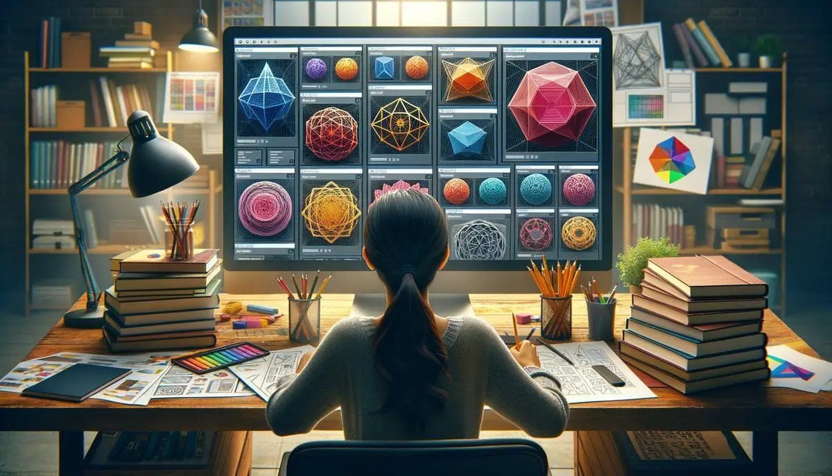
Tired of your websites looking like every other grid-based layout? Ready to break free from the tyranny of the rectangle and inject some serious personality into your digital canvas? Then it's time to explore the truly creative applications of CSS clip-path. This isn't just a technical spec; it's a license to sculpt, shape, and transform your web designs into something visually captivating and uniquely yours.
clip-path isn't just about hiding parts of an image; it's about redefining the very boundaries of your web elements. Imagine buttons that ripple, sections that undulate, or hero images that break out of their rectangular confines, drawing the eye with unexpected angles and organic curves. With a dash of CSS magic, you can turn flat, predictable designs into dynamic, engaging experiences that captivate your audience and align perfectly with your brand's unique identity.
At a Glance: Sculpting Your Web with clip-path
- What it does: Defines the visible portion of an HTML element using geometric shapes.
- Why it matters: Allows for non-rectangular designs, breaking typical grid layouts.
- Core functions:
polygon(), circle(), ellipse(), inset() for precise control. - Creative power: Transforms everything from images and sections to interactive elements.
- Key distinction: Different from
shape-outside, which controls text flow around a shape. - Impact: Fosters creativity, enhances visual storytelling, and boosts user engagement.
- Tooling up: Generators and browser dev tools are your best friends for complex shapes.
The Canvas is Calling: What Exactly is CSS clip-path?
At its heart, clip-path is a CSS property that lets you define a specific clipping region for an element. Think of it like taking a pair of scissors to a piece of paper: only the part inside the cut-out shape remains visible. The rest is rendered transparent. This simple concept unlocks a world of design possibilities, allowing you to move beyond the conventional rectangular boxes that dominate so much of the web.
You'll primarily work with a few key shape functions:
polygon(): Your most versatile tool. It defines a shape using a series of x and y coordinates, allowing you to create anything from triangles and trapezoids to complex, multi-point custom shapes.circle(): Creates a perfect circle, defined by its radius and an optional center point.ellipse(): Similar to circle(), but allows for different horizontal and vertical radii, letting you create ovals.inset(): Defines a rectangular clipping region by "insetting" from the element's edges, useful for creating rounded corners or slightly offset borders without needing extra elements.
While clip-path controls the visible area of an element, you might also hear about shape-outside. It's crucial to understand the difference: shape-outside dictates how other content (like text) wraps around an element, creating custom content flows. clip-path, on the other hand, clips the element itself. Often, these two properties work hand-in-hand to achieve truly organic compositions, but clip-path is the primary driver for giving elements their unique, non-rectangular form.
Why clip-path is a Game-Changer for Modern Web Design
In a digital landscape saturated with predictable designs, clip-path offers a powerful way to stand out. It's not just a stylistic flourish; it's a strategic tool for enhancing user experience and brand identity.
Visual Storytelling Beyond the Box
Humans are inherently drawn to novelty and unique aesthetics. clip-path empowers you to tell your story in a visually richer way, breaking the monotony of standard layouts. Imagine a photography portfolio where images are presented as shattered glass fragments, or a product showcase where items emerge from organic, leaf-like shapes. These design choices create an immediate, memorable impact that traditional rectangular frames simply can't achieve. You're not just displaying content; you're crafting an experience.
Aligning Design with Brand Identity
Every brand has a unique personality. Some are sharp and edgy, others soft and organic, futuristic, or playful. clip-path provides a direct way to translate these brand attributes into the very structure of your website. A tech startup might use sharp, angular polygons for their hero sections, while an eco-friendly brand could opt for smooth, wave-like ellipses. This level of visual consistency strengthens brand recognition and reinforces your message without relying solely on colors or typography.
Interactive Magic: Engaged Users are Happy Users
One of the most exciting applications of clip-path is its ability to transform static elements into dynamic, interactive components. Think beyond simple color changes on hover. With clip-path, you can create buttons that morph into new shapes, reveal hidden content with a spotlight effect, or introduce playful transitions that make your website feel alive. These micro-interactions don't just look good; they provide satisfying feedback, encourage exploration, and make the user's journey more engaging. When users feel a website is responsive and thoughtfully designed, their perception of the brand improves significantly.
Hands-On Creativity: Practical Applications & How-Tos
Let's dive into some concrete examples and techniques where clip-path truly shines.
Beyond the Basic Box: Shaping Images and Sections
The most straightforward application is giving non-rectangular shapes to elements like <img> tags or entire <div> sections. This instantly elevates a design from ordinary to artistic.
Example: A Diagonal Section Divider
Instead of a plain horizontal line, you can create a striking diagonal separation between sections:
css
.diagonal-section {
background-color: #f0f0f0;
padding: 80px 0;
/* Define a polygon shape */
-webkit-clip-path: polygon(0 0, 100% 0, 100% 85%, 0 100%);
clip-path: polygon(0 0, 100% 0, 100% 85%, 0 100%);
}
.next-section {
background-color: #3498db;
color: white;
padding: 80px 0;
}
This creates a section where the bottom edge slants upwards from left to right, providing a dynamic visual break.
You can craft virtually any shape:
- Diamonds:
polygon(50% 0%, 100% 50%, 50% 100%, 0% 50%) - Hexagons:
polygon(50% 0%, 100% 25%, 100% 75%, 50% 100%, 0% 75%, 0% 25%) - Custom Waves: These often require many
polygon points or can be more easily achieved with SVG, but simple wave segments are possible.
Crafting complex polygon() paths can be tricky to do by hand. That's where visual tools become indispensable. You can quickly generate the precise CSS coordinates for intricate shapes using our clip-path generator, saving you hours of trial and error.
Interactive Wonders: Buttons, Hover Effects & Reveals
This is where clip-path truly flexes its muscles, turning passive elements into active participants in the user experience.
The Spotlight Reveal Effect: A Playful Illusion
One highly engaging effect is the "spotlight" or "flashlight" interaction, perfect for portfolio links or gallery items. Imagine a block of text, behind which a hidden image subtly waits. As the user moves their mouse over the text, a circular "spotlight" follows, revealing the underlying image and often inverting the text color within the revealed circle.
How it Works:
- Layering: You need two layers within a container. The bottom layer holds the image you want to reveal. The top layer contains your text and acts as the "mask."
- Initial State: The top layer is initially opaque, covering the image.
- Mouse Tracking: JavaScript tracks the
mousemove event within the container. clip-path Magic: On each mousemove, the clip-path property of the top layer is dynamically updated. A circle() function is used, with its x and y center coordinates set to match the current mouse position. The radius of the circle determines the size of your spotlight.- Text Inversion (Optional but cool): To achieve the inverted text color within the spotlight, you can use
mix-blend-mode: difference on the text, or, more robustly, duplicate the text with a different color and clip it with the same clip-path.
Browser Support for Spotlight Effect: This advanced technique works reliably in modern browsers, specifically Chrome 88+, Edge 88+, Safari 14+, and Firefox 86+. Always test your effects across target browsers!
Mini-Example (Conceptual CSS & JS Snippet):
html

Hover to Reveal!
Discover something amazing underneath.
css
.spotlight-container {
position: relative;
overflow: hidden; /* Crucial for clipping */
cursor: none; /* Hide default cursor */
/* Add dimensions */
width: 100%;
height: 300px;
}
.hidden-image {
position: absolute;
top: 0;
left: 0;
width: 100%;
height: 100%;
object-fit: cover;
z-index: 1;
}
.text-overlay {
position: absolute;
top: 0;
left: 0;
width: 100%;
height: 100%;
background-color: #222; /* Background when image is hidden */
color: #fff;
display: flex;
flex-direction: column;
justify-content: center;
align-items: center;
text-align: center;
z-index: 2;
/* Initial clip-path is full view, but we'll manipulate it */
-webkit-clip-path: circle(0% at 0 0); /* Start hidden or fully visible based on intent */
clip-path: circle(0% at 0 0);
transition: clip-path 0.1s linear; /* Smooth mouse tracking */
will-change: clip-path; /* Performance hint */
}
.text-overlay h2,
.text-overlay p {
mix-blend-mode: difference; /* Inverts color over image */
}
javascript
const spotlightContainer = document.querySelector('.spotlight-container');
const textOverlay = document.querySelector('.text-overlay');
spotlightContainer.addEventListener('mousemove', (e) => {
const rect = spotlightContainer.getBoundingClientRect();
const x = e.clientX - rect.left; // X position within the element
const y = e.clientY - rect.top; // Y position within the element
// Update clip-path to follow cursor
textOverlay.style.clipPath = `circle(100px at ${x}px ${y}px)`; // 100px is spotlight radius
textOverlay.style.webkitClipPath = `circle(100px at ${x}px ${y}px)`;
});
// Reset clip-path when mouse leaves
spotlightContainer.addEventListener('mouseleave', () => {
textOverlay.style.clipPath = `circle(0% at 0 0)`; // Or `circle(100% at center)` to hide effect
textOverlay.style.webkitClipPath = `circle(0% at 0 0)`;
});
This effect adds a layer of depth and playfulness, making the user's interaction truly memorable.
#### Animated Buttons and Hover States
Another dynamic use case involves animating `clip-path` on hover. Imagine a button that, on hover, expands from a diamond shape into a full rectangle, or a tab that subtly changes its clipped edge to indicate selection.
css
.animated-button {
background-color: #e74c3c;
color: white;
padding: 15px 30px;
border: none;
font-size: 1.2em;
cursor: pointer;
-webkit-clip-path: polygon(50% 0%, 100% 50%, 50% 100%, 0% 50%);
clip-path: polygon(50% 0%, 100% 50%, 50% 100%, 0% 50%);
transition: all 0.3s ease-out; /* Smooth transition for clip-path */
}
.animated-button:hover {
background-color: #c0392b;
-webkit-clip-path: polygon(0% 0%, 100% 0%, 100% 100%, 0% 100%); /* Becomes a rectangle */
clip-path: polygon(0% 0%, 100% 0%, 100% 100%, 0% 100%);
}
This button starts as a diamond and smoothly transitions to a rectangle on hover, adding a sophisticated touch. Remember that for smooth animations of `clip-path`, the starting and ending shapes must have the *same number of points* when using `polygon()`. If not, the browser can't interpolate the points, and the animation will jump.
### Text & Content Flow: The Synergy with `shape-outside`
While `clip-path` focuses on the element itself, its full artistic potential is often realized when combined with `shape-outside`. If you clip an image to be a circle, and then apply `shape-outside: circle()` to it, the surrounding text will beautifully wrap around that circular image, rather than its original rectangular bounding box. This creates magazine-like layouts with organic text flows that are simply impossible with traditional CSS.
For example, imagine an article with an image that's clipped into a complex, irregular polygon. By also applying a `shape-outside` property with the *same polygon* (or a slightly adjusted one), your body text will gracefully flow around the contours of that unique image. This attention to detail significantly enhances readability and visual appeal, turning what could be a dull block of text into an engaging visual journey.
## Mastering the Tools: Tips for Implementation
To harness the full power of `clip-path` without encountering common pitfalls, consider these best practices.
### Browser Support and Fallbacks
While `clip-path` enjoys good support in modern browsers, older versions might not render complex shapes. Always check Can I Use for specific functions. For critical designs, consider fallbacks:
* **Simple fallback:** Provide a solid background color or a standard rectangular image version for browsers that don't support `clip-path`.
* **Modernizr:** Use a feature detection library like Modernizr to apply `clip-path` only where supported, otherwise serving a fallback style.
* **SVG Fallback:** For very complex or animated shapes, consider using inline SVGs, which have wider support and can be used to clip HTML content.
css
.my-clipped-element {
/* Fallback for older browsers */
background-color: #ccc;
border-radius: 10px; /* Another fallback style */
/* Modern clip-path */
-webkit-clip-path: polygon(...);
clip-path: polygon(...);
}
### Accessibility: Ensuring Everyone Sees Your Vision
When you clip an element, you're only changing its visual representation. The entire element, including any text or interactive content, is still present in the DOM. This is generally good for accessibility, as screen readers will still announce all content. However, be mindful of:
* **Contrast:** Ensure clipped text still has sufficient color contrast against its visible background.
* **Focus outlines:** If you clip interactive elements like buttons, make sure their focus outlines are still visible and follow the clipped shape, or provide a clear alternative. Consider `
web accessibility considerations` from the start.
* **Information loss:** Don't clip away information crucial to understanding. For instance, if you clip an image so only a tiny portion is visible, make sure its `alt` text accurately describes the *full* image content.
### Performance: Smooth Shapes, Fast Loads
`clip-path` is generally performant. Unlike masking with large transparent PNGs or complex SVG filters, CSS `clip-path` is often hardware-accelerated. However, a few considerations:
* **Too many points:** Extremely complex `polygon()` shapes with hundreds of points might slightly impact rendering performance, especially on animation. Simplify where possible.
* **`will-change`:** For animating `clip-path`, adding `will-change: clip-path;` can hint to the browser to optimize for future changes, potentially improving animation smoothness.
* **Image optimization:** Clipped images are still full images. Always ensure you are
optimizing images for web performance to keep load times down.
### Responsiveness: Shapes That Adapt
Your custom shapes need to look good on all screen sizes.
* **Percentage values:** Define `polygon()`, `circle()`, and `ellipse()` coordinates using percentages (`%`) relative to the element's width/height. This allows the shape to scale proportionally with the element.
* **`calc()` and viewport units:** For more precise control, `calc()` and viewport units (`vw`, `vh`) can be useful, though they require careful testing.
* **Media queries:** For drastically different layouts or to simplify shapes on smaller screens, use media queries to change the `clip-path` property. You might use a more complex polygon on desktop and a simpler circle or even a rectangle on mobile.
* **`object-fit`:** When clipping images, `object-fit: cover;` or `contain;` helps control how the image scales within its new, clipped boundaries. Consider how the image content will be cropped by the clip path. A face might be accidentally clipped out if the image isn't handled correctly. Mastering
responsive design techniques is key here.
### Animation: Bringing Shapes to Life
Animating `clip-path` can add incredible dynamism to your designs.
* **`transition` property:** Use the `transition` property on `clip-path` to smoothly animate between two states (e.g., `clip-path: polygon(...)` to `clip-path: circle(...)`).
* **Keyframe animations:** For more complex, multi-step animations, use `@keyframes` to define sequences of `clip-path` values.
* **Matching points:** As mentioned, when animating `polygon()` shapes, ensure the starting and ending polygons have the *same number of points*. If the point counts differ, the animation will likely jump rather than transition smoothly. This is a common hurdle but easily overcome with careful planning.
* **Easing functions:** Experiment with different `transition-timing-function` values (e.g., `ease-in-out`, `cubic-bezier`) to control the acceleration and deceleration of your shape animations. For more intricate movement, explore
best practices for CSS animations.
## Common Questions & Pitfalls
Let's address some frequent inquiries and potential traps.
**"Is `clip-path` good for SEO?"**
Yes, in the sense that `clip-path` only affects the *visual display* of an element, not its underlying content. Search engines will still see and index all the text and images within the clipped element. It doesn't hide content from crawlers; it merely shapes its presentation for users.
**"Can I clip text directly?"**
You can apply `clip-path` to an element containing text (e.g., a `
` or ``). However, `clip-path` clips the *entire bounding box* of the element, not individual letterforms. If you want to create truly custom text shapes (e.g., text filling a star), you'd typically need more advanced techniques like SVG masks or specialized text rendering methods. `clip-path` is best for shaping the container *around* the text, or revealing text in creative ways as seen with the spotlight effect.
**"What about SVG clip-paths?"**
`clip-path` in CSS is inspired by SVG's `` element, and you can indeed reference an SVG `` from your CSS. This is particularly useful for highly intricate or vector-based shapes that are difficult to define purely with CSS `polygon()` coordinates. You'd define your clip path in an SVG, give it an ID, and then reference it in your CSS: `clip-path: url(#mySvgClipPath);`. This offers incredible flexibility but adds a layer of complexity by requiring SVG knowledge.
**Over-complexity: When to draw the line.**
While `clip-path` is powerful, resist the urge to overdo it. A website where every single element is a bizarre, irregular shape can quickly become chaotic and difficult to navigate. Use `clip-path` purposefully to highlight key elements, create visual hierarchy, or reinforce brand aesthetics. A few well-placed, artfully clipped elements will have a much greater impact than an entire page of visual noise. Simplicity often breeds elegance.
## Your Next Creative Leap: Beyond the Rectangle
CSS `clip-path` offers an exhilarating escape from the ubiquitous rectangular prison of traditional web design. It's a tool that empowers you to inject genuine artistry, brand personality, and engaging interactivity into your projects. From subtly angled sections that guide the eye to dramatic spotlight reveals that delight users, the potential is limited only by your imagination.
Start small. Experiment with simple diagonal dividers or diamond-shaped images. Use tools like `clip-path` generators to explore complex polygons without the headache of manual coordinate plotting. Then, as your confidence grows, venture into dynamic hover effects and interactive masks.
The web is a visual medium, and `clip-path` is your sculptor's chisel. Go forth and create designs that not only function flawlessly but also truly captivate, leaving a lasting impression on every visitor. Your next project could be the one that truly breaks the mold.